Packaging color was mostly about making a product look attractive. Then I started paying closer attention to what made me stop in an aisle, pick up one product instead of another, and trust a brand before reading a single word. That is when I realized color does much more than decorate a box or label.
The Psychology of Color in Packaging and Label Design is about how colors shape emotion, attention, trust, and buying decisions. Whether a brand sells snacks, beauty products, supplements, beverages, candles, or premium gifts, color often creates the first impression. Before a customer reads the product name, checks the price, or looks at the ingredients, the color has already started telling a story.
Why Color Matters in Packaging
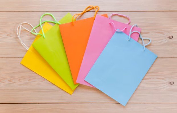
Color is one of the fastest ways to communicate value. A bold red label can feel energetic and urgent. A soft green box can suggest wellness, freshness, or natural ingredients. A black and gold package can feel elegant, expensive, and gift-worthy.
For brands selling in crowded retail aisles or online marketplaces, color also improves visibility. A product may have only a few seconds to catch attention. If the color palette blends in with every competitor, the product can disappear even if the quality is excellent.
Good packaging color also supports memory. When customers recognize a color pattern repeatedly, they begin to connect it with the brand. That is why strong brands rarely choose colors randomly. They use color to create recognition, emotion, and trust.
How Colors Influence Customer Emotions
Different colors create different emotional signals. Red often feels bold, passionate, exciting, or urgent. It works well for food, drinks, sales packaging, and products that need energy. Blue is often linked with trust, calmness, and reliability. It is common in healthcare, technology, finance, personal care, and products that need to feel safe.
Green often suggests nature, wellness, freshness, sustainability, and balance. It works well for organic food, skincare, eco-friendly packaging, supplements, and garden products. Yellow feels cheerful, youthful, and optimistic. It can grab attention quickly, but it must be balanced carefully because too much yellow can feel overwhelming.
Black signals luxury, power, confidence, and exclusivity. It works well for premium cosmetics, fashion products, gourmet food, and high-end gift packaging. White suggests simplicity, cleanliness, purity, and minimalism. It is often used in beauty, wellness, medical, and modern lifestyle packaging. Purple can feel creative, premium, spiritual, or imaginative. It is common in beauty, wellness, specialty foods, and artistic brands.
Choosing the Right Color for Your Product Category
The best color choice depends on the product, audience, price point, and brand promise. A children’s snack brand may need playful colors, while a luxury skincare brand may need muted tones and elegant contrast.
Food packaging, color should support appetite and freshness. Warm tones like red, orange, and yellow can feel energetic and inviting. Natural food brands often lean into green, cream, brown, or earthy shades.
For beauty and skincare, color must match the product experience. Soft pastels can feel gentle. Black can feel premium. White can feel clinical and clean. Metallic accents can make the product feel more expensive.
Health and wellness products, trust is essential. Green, blue, white, and soft neutrals often work well because they feel calm, clean, and dependable.
For luxury products, color should feel intentional, not loud. Black, deep navy, emerald, burgundy, gold, silver, and matte finishes can create a premium impression.
The Role of Contrast and Readability
Dark text on a light background is usually easier to read. Light text on a dark background can also work when the font is clear and large enough. Low contrast combinations, such as pale yellow on white or dark blue on black, can make packaging look weak and hard to scan.
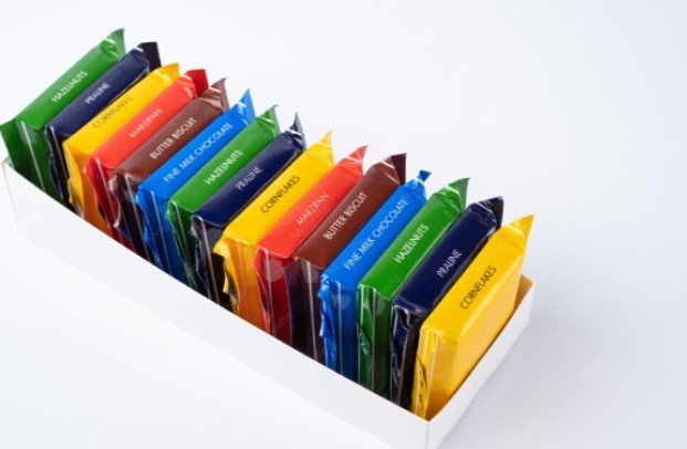
Labels should also guide the eye. The brand name, product type, key benefit, flavor, size, and callout should not compete equally. Color can separate important details and make the label easier to understand.
Shelf Appeal vs Online Product Images
Packaging must work in two places: on the shelf and on the screen. In stores, the color needs to stand out from competitors. Online, it must look clear in a thumbnail image.
A color that looks beautiful in person may appear dull in a small ecommerce photo. Matte textures, metallic finishes, and subtle gradients can lose impact online. That is why brands should test packaging under store lighting and digital mockups before final printing.
This is where The Psychology of Color in Packaging and Label Design becomes practical. The goal is not only to choose a pretty color. The goal is to choose a color that performs in real buying environments.
Common Color Mistakes in Packaging
One common mistake is copying competitors too closely. If every product in a category uses green, another green package may not stand out unless the shade, layout, or finish feels unique. Another mistake is choosing personal favorite colors instead of customer-focused colors.
A founder may love purple, but if the product needs to feel fresh, natural, and simple, green or cream may work better. Some brands also use too many colors at once. A crowded palette can make packaging feel cheap or confusing.
Strong packaging usually has one dominant color, one or two supporting colors, and clear contrast. Print testing is also important. Colors can change depending on paper stock, label material, ink, coating, foil, gloss, or matte finish. A color that looks bright on screen may print darker or flatter.
How to Build a Smart Packaging Color Palette
Start with the brand personality. Is the product playful, premium, natural, bold, clean, elegant, or practical? The color should support that identity. Next, define the customer. Younger shoppers may respond to bold and trendy palettes.
Premium buyers may prefer refined, minimal, or rich colors. Wellness-focused customers may expect calm, natural tones. Then study competitors. The goal is not to copy them. The goal is to understand category expectations and find a smart way to stand apart.
After that, test the palette in real packaging mockups. Place the design beside competitors, view it from a distance, and shrink it down to ecommerce thumbnail size. If the product still looks clear, memorable, and trustworthy, the palette is stronger.
Frequently Asked Questions
1. What is The Psychology of Color in Packaging and Label Design?
The Psychology of Color in Packaging and Label Design is the study of how packaging colors influence customer emotions, brand perception, trust, attention, and purchase decisions.
2. What color is best for product packaging?
There is no single best color for every product. The best choice depends on the brand, product category, target customer, price level, and emotional message.
3. What colors make packaging look expensive?
Black, gold, deep navy, burgundy, emerald, silver, and muted neutrals often make packaging feel premium when paired with clean typography and quality finishes.
4. Why is color important in label design?
Color helps labels attract attention, improve readability, communicate product benefits, and create instant brand recognition.
Final Thoughts That Actually Matter
I believe color is one of the most powerful tools in packaging because it works before words do. It tells shoppers what to feel, what to expect, and whether a product deserves attention.
The smartest brands do not choose packaging colors randomly. They use color to create emotion, trust, contrast, shelf appeal, and memory. When the palette matches the product and customer, packaging becomes more than a container. It becomes a silent salesperson.