I can usually tell whether a business feels trustworthy within seconds of opening its website. Surprisingly, that reaction rarely comes from the logo alone. Typography creates most of that first impression.
That is why typography in branding design matters far more than many companies realize. Fonts shape professionalism, readability, emotional perception, and even buying decisions before customers consciously process the message.
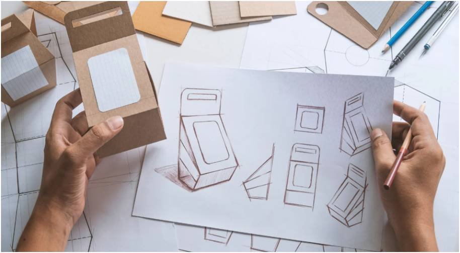
I noticed this clearly while redesigning a small ecommerce homepage last year. We changed only the typography hierarchy and spacing. Within weeks, the bounce rate dropped noticeably and visitors spent longer reading product pages. The colors, products, and layout stayed exactly the same.
Typography quietly influences almost every interaction customers have with a brand.
Why Typography Matters More Than Most Brands Realize

Typography acts as the visual tone of a brand. Customers react emotionally to font choices long before they finish reading the actual words.
A luxury skincare company using heavy block fonts may feel harsh instead of elegant. A cybersecurity company using playful handwritten typography may appear less credible immediately.
Good typography improves:
- recognition
- readability
- consistency
- customer confidence
Research from the Nielsen Norman Group shows that readable typography improves comprehension and user satisfaction. That directly affects how long users stay on websites and how comfortably they interact with content.
Typography also creates consistency across websites, packaging, social media, email campaigns, and advertisements. That repeated visual familiarity strengthens brand memory over time.
The Psychology Behind Typography in Branding Design

Different typography styles create different emotional reactions. That psychological connection explains why brands carefully choose specific font categories.
How Serif Fonts Influence Trust
Serif fonts contain small decorative strokes on letter edges. They often feel formal, reliable, and established.
That is why industries like finance, publishing, and luxury retail commonly use serif typography.
Examples include:
- Time
- Tiffany & Co.
Serif fonts work especially well for brands wanting a timeless image.
Why Sans-Serif Fonts Dominate Modern Brands
Sans-serif fonts remove decorative strokes and create cleaner lines. They usually appear modern, simple, and efficient.
Tech companies strongly favor this style because it improves digital readability across mobile devices and screens.
Examples include:
- Airbnb
I personally prefer sans-serif body typography for websites because it scales more naturally on responsive layouts.
When Script Fonts Actually Work
Script typography mimics handwriting and often feels personal or elegant. It can add personality quickly when used carefully.
The problem appears when businesses overuse it.
I regularly see script fonts applied to menus, long paragraphs, or navigation bars. That immediately damages readability.
Script typography works best for logos, short headlines, luxury packaging, or signature branding elements.
The 3-Font System Strong Brands Use
Most successful brands use a simple typography structure built around two or three fonts.
The primary typeface usually appears in logos and major headlines. This font carries the strongest visual personality.
The secondary typeface handles body content and longer text sections. Readability becomes the top priority here because customers need to process information quickly.
An accent font may appear occasionally for promotions, call-to-actions, or decorative highlights. I always recommend using accent typography sparingly because excessive variation creates visual clutter fast.
Strong typography systems feel organized without looking repetitive.
Common Typography Mistakes That Hurt Branding

Most typography problems come from inconsistency rather than bad font choices.
One major mistake is mixing too many fonts together. Brands often combine trendy typography styles without considering how they interact visually.
Another issue is weak mobile readability. Tiny font sizes and poor spacing create frustrating user experiences on smaller screens.
I also frequently notice businesses prioritizing style over clarity. Typography should support communication first. Decorative choices should never reduce readability.
Page speed matters too. Heavy custom font files can slow websites significantly. According to Google PageSpeed Insights, loading performance directly impacts usability and search visibility.
Fast typography systems support both SEO and customer experience.
How I Audit Typography Across a Brand
When reviewing typography in branding design, I follow a simple evaluation process.
First, I compare typography consistency across every customer touchpoint. Websites, packaging, ads, and social media graphics should feel visually connected.
Next, I test readability on mobile devices because mobile typography problems often go unnoticed during desktop design reviews.
I also examine heading hierarchy carefully. Customers should instantly recognize the difference between headlines, body copy, and CTAs.
Finally, I evaluate emotional alignment. Typography should visually support the brand’s identity instead of conflicting with it.
This process usually exposes weaknesses that businesses never recognize internally.
Typography Trends Changing Branding in 2026
Typography trends continue shifting toward flexibility, accessibility, and cleaner digital experiences.
Variable fonts are becoming increasingly popular because they improve loading performance while offering flexible weight adjustments across devices.
Oversized typography also continues growing because stronger hierarchy improves scanning behavior on mobile screens.
Accessibility-focused typography has become another major priority. More brands now optimize:
- contrast ratios
- readable spacing
- mobile font sizing
- accessibility compliance
Minimal typography systems are also replacing overly decorative branding styles. Cleaner systems usually create stronger long-term consistency.
How Typography Impacts Website Conversions
Typography directly influences customer behavior online.
Clear typography improves reading flow, reduces friction, and makes navigation easier. Customers feel more comfortable interacting with brands that look visually organized.
I tested this on a service-based website by simplifying typography spacing and reducing paragraph width. Conversion rates improved noticeably within a month despite no changes to the offer itself.
Small typography adjustments often create larger business results than companies expect.
This connects closely with broader branding principles discussed in Graphic Design Tips For Business Marketing.
Best Font Pairing Strategies for Businesses
Strong font pairing creates balance without visual competition.
One reliable strategy combines serif headlines with sans-serif body text. That pairing creates personality while maintaining readability.
Another effective approach uses bold geometric typography for headings and neutral typography for supporting content.
I avoid combining fonts that look too similar because the contrast feels awkward instead of intentional.
A good typography pairing should feel effortless to readers.
FAQs
1. What is typography in branding design?
Typography in branding design refers to how brands use fonts, spacing, hierarchy, and text styling to visually communicate personality and identity.
2. Why is typography important for branding?
Typography improves readability, consistency, recognition, and trust. It shapes how customers emotionally perceive a brand.
3. Which typography style works best for modern brands?
Sans-serif typography remains popular for modern digital brands because it appears clean and performs well across mobile devices.
4. How many fonts should a business use?
Most professional brands use two or three fonts to maintain consistency and visual hierarchy.
5. Does typography affect SEO performance?
Indirectly, yes. Better readability, accessibility, and faster page performance improve user experience signals that support SEO.
Your Fonts Might Be Sabotaging Your Brand
Many businesses spend heavily on logos while ignoring the typography that customers see every day.
That mistake quietly weakens branding.
Typography shapes trust faster than most visual elements because customers process font styles almost instantly. A strong typography system improves recognition, readability, and consistency across every platform.
If your branding feels outdated or disconnected, start by reviewing your typography choices before redesigning everything else. Small font changes can dramatically improve how customers perceive your business.