
I once watched a local restaurant spend thousands on magazine ads that looked beautiful but generated almost no calls. A month later, they changed only three things: the headline, image placement, and call-to-action box. The next campaign doubled coupon redemptions.
That experience completely changed how I approach print advertising design tips for flyers, postcards, brochures, and magazine ads. Most print ads fail because they try to say too much at once. Great print advertising works differently. It guides the eye, creates emotion quickly, and makes the next step impossible to miss.
Print still matters in 2026. Research from marketing studies continues to show stronger recall rates for physical advertising compared to many digital formats. People spend more time with printed material because it feels more intentional and less disposable.
Why Most Print Ads Fail Fast
Most people decide within seconds whether your ad deserves attention.
That sounds harsh, but it explains why clutter destroys performance. When I review weak print campaigns, the same issues appear repeatedly. The layout feels crowded, the text is difficult to scan, and the offer gets buried under unnecessary details.
Readers should immediately understand three things:
- What this is
- Why it matters
- What they should do next
If they have to work for clarity, the ad already lost momentum.
Build a Layout That Guides Attention

The best print ads control where readers look first.
Strong visual hierarchy creates a natural flow from the main image to the headline, then toward the offer and CTA. One cleaning company I worked with redesigned a postcard by simply enlarging the offer and moving it near the headline. Their response rate improved noticeably within the next campaign.
Size plays a major role in attention. The most important message should always dominate visually. Many businesses mistakenly make the logo the largest element on the page, even though customers care more about benefits than branding during first contact.
Spacing also matters. Short paragraphs and visible breaks improve readability, especially for older audiences reading newspapers or magazines.
Color selection also influences how people emotionally respond to printed ads. Understanding how color psychology impacts branding can help businesses choose shades that create trust, urgency, luxury, or excitement more effectively.
Why White Space Makes Ads Perform Better
White space is one of the most misunderstood parts of print design.
Many business owners think empty space means wasted space. In reality, it increases focus and gives the design a more premium appearance. Luxury brands use this strategy constantly because minimal layouts feel intentional and sophisticated.
I once redesigned a crowded brochure by removing nearly 40% of the text. The client worried it looked “too empty” on screen. After printing, the cleaner version immediately looked more trustworthy and easier to read.
Crowded ads create stress. Clean layouts create confidence.
Headlines That Stop Readers Mid-Page
Your headline often determines whether the rest of the ad gets read at all.
Strong print headlines usually focus on benefits, urgency, or curiosity. Shorter headlines also work better because people scan printed material quickly while flipping pages or sorting mail.
A good headline feels direct and useful. Weak headlines usually sound vague or overly clever.
For example:
- Cut Your Energy Costs Faster
- Your Kitchen Needs Better Storage
- Scan for a Free Estimate
Simple wording almost always performs better than confusing creativity.
Image Quality Can Make or Break Trust

Poor-quality images instantly reduce credibility.
Professional print advertising requires 300 DPI resolution and CMYK color mode. Images that look sharp online can print blurry or dull if prepared incorrectly.
One of the biggest improvements businesses can make is using a single strong “hero” image instead of multiple competing visuals. Magazine ads especially benefit from this approach because readers process one dominant image faster than a busy collage.
Photos with real people also create stronger emotional connection than generic object photography. Restaurants, healthcare providers, fitness brands, and beauty companies often see better engagement when customers can picture themselves using the service.
Direct Mail Design Tactics That Increase Responses
Direct mail advertising competes against an entire stack of mail. Your design must interrupt attention immediately.
The front side should focus on one main hook. A bold headline, one offer, and one strong image usually perform best. The back side can handle supporting details and additional information.
High-contrast offer boxes work especially well for discounts and promotions. Bright visual containers naturally pull attention toward the most valuable message on the page.
Tri-fold brochures also remain effective because they allow information to unfold gradually. Instead of overwhelming readers immediately, they guide people through the message step by step.
Personalization has also become more important in modern print campaigns. Even small touches like location references or handwritten-style notes can make direct mail feel more personal and less mass-produced.
Magazine Advertising Requires Different Design Choices
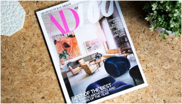
Magazine readers behave differently from direct mail readers.
They browse casually and expect visual storytelling. That creates more room for creative concepts and emotional design.
One of the most effective techniques in magazine advertising is the use of visual metaphors. Instead of directly explaining a message, the design compares the idea to another object or experience. A battery brand might use marathon imagery to suggest endurance. A finance company might use bridges to symbolize stability.
These visual shortcuts create memorable emotional reactions faster than long paragraphs of copy.
Magazine ads also require strict technical preparation. Designers must account for bleed areas, safe zones, and gutter spacing to prevent important content from being cut off during printing and binding.
Print Production Mistakes That Hurt Campaigns
Some print ads fail before they even reach customers.
I still see businesses submitting RGB files to printers or stretching low-resolution graphics into large-format ads. These mistakes instantly reduce quality.
Professional print campaigns should always use:
- 300 DPI resolution
- CMYK color mode
- Proper bleed margins
- Embedded fonts
- Vector logo files
Testing physical proofs is equally important. Colors, spacing, and readability often change once the design moves from screen to paper.
I never recommend approving a print campaign without holding a physical sample first.
How QR Codes Modernized Print Advertising
QR codes changed print advertising dramatically because they connected offline marketing to measurable digital actions.
Modern print campaigns now use QR codes to direct readers toward landing pages, booking forms, coupons, or video demonstrations. This makes ROI tracking far easier than traditional print campaigns from the past.
Placement matters, though. QR codes work best when surrounded by white space and paired with a clear instruction such as “Scan to Redeem” or “Scan for Your Discount.”
Without guidance, many readers simply ignore them.
FAQs About Print Advertising Design Tips
1. What are the best print advertising design tips for beginners?
The best beginner strategies include using clear headlines, one strong image, readable fonts, white space, and a visible CTA.
2. What image resolution should print ads use?
Professional print advertising should use 300 DPI images in CMYK color mode for sharp, accurate printing.
3. Why does white space improve print advertising?
White space reduces clutter, improves readability, and helps important design elements stand out faster.
4. Do QR codes still work in print advertising?
Yes. QR codes help connect physical advertising with digital actions like coupons, landing pages, and bookings.
5. What is the best layout for direct mail flyers?
The strongest direct mail flyers usually place the main offer and headline on the front side while using the back side for supporting details and CTA information.
Your Print Ad Should Demand Attention, Not Beg for It
Most print ads fail because they try too hard to include everything.
The strongest campaigns feel focused, visually confident, and emotionally immediate. They guide the reader naturally instead of overwhelming them with information.
The next time you design a flyer, postcard, or magazine ad, remove one unnecessary element before adding something new. That single change often improves the entire piece faster than another paragraph ever could.