I can usually tell how customers will react to a brand before they ever describe it. Most of the time, the answer sits in the color palette.
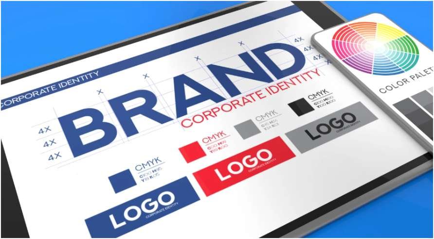
I have watched businesses redesign websites, update packaging, and refresh logos only to see customer perception shift almost overnight. The products stayed the same. The emotional reaction changed completely. That is why understanding how color psychology impacts branding matters far more than many companies realize.
Research from the University of Winnipeg suggests people form first impressions within seconds, and color heavily influences those decisions. Consistent color usage can also improve brand recognition significantly. That explains why some companies become recognizable from a single shade alone.
Why Customers Judge Brands by Color So Quickly
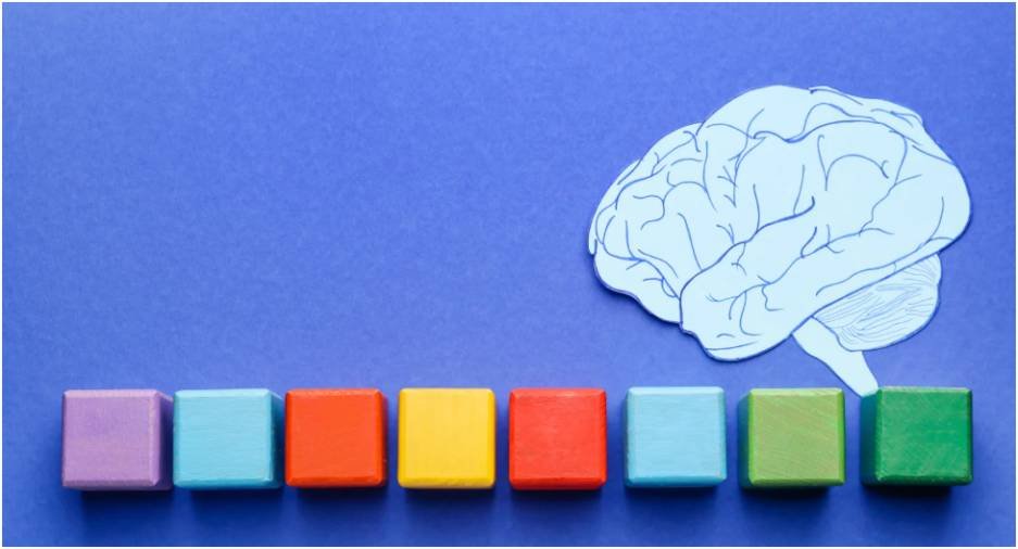
The brain processes visuals faster than text. Customers notice colors before they read your slogan, pricing, or product details.
That instant emotional response shapes trust levels immediately.
A dark blue website often feels secure and professional. Bright neon colors may feel energetic but less reliable. Earthy tones usually create a calm and natural feeling. Customers make these judgments subconsciously.
I once compared two supplement brands with nearly identical products. One used muted greens and soft neutrals. The other relied heavily on aggressive reds and black backgrounds. The calmer design produced longer browsing sessions and better engagement because shoppers connected the palette with health and trust.
That experience changed the way I evaluate branding completely.
The Emotional Meaning Behind Popular Brand Colors
Blue and Trust
Blue remains one of the most trusted colors in branding because it communicates reliability and stability.
That is why financial companies and technology brands use it so frequently. Businesses like PayPal and IBM rely heavily on blue because customers expect those industries to feel dependable.
Darker blues often appear authoritative, while lighter blues feel more approachable.
Red and Urgency
Red attracts attention immediately. It creates excitement, urgency, and emotional intensity.
Fast-food companies use red because it stimulates appetite and encourages quick decisions. Retail businesses also use it during promotions because it increases visual urgency.
Brands like Coca-Cola continue using red because it creates strong emotional recall across generations.
Green and Wellness
Green is closely connected to nature, health, freshness, and sustainability.
Modern consumers often associate green branding with eco-conscious values before reading any product description. That makes it highly effective for wellness companies and organic brands.
Businesses like Whole Foods Market and Starbucks use green to reinforce ideas of balance and growth.
Muted green shades currently perform better than overly bright greens because they feel more authentic.
Black and Luxury
Black creates a feeling of sophistication and exclusivity.
Luxury companies use black because it supports minimalist design while making products appear premium. Brands such as Apple Inc. and Nike combine black with clean layouts to create a polished identity.
Black also reduces visual clutter, which makes branding feel more refined.
Yellow and Attention
Yellow communicates optimism, warmth, and energy.
It is one of the fastest colors for grabbing attention, which explains why brands like McDonald’s and Snapchat use it heavily in branding.
The challenge with yellow is balance. Too much can overwhelm the viewer. Strong brands usually use it as an accent rather than a dominant background color.
How Different Industries Use Color Psychology

Finance and Tech
Trust drives these industries, so blue, charcoal, and deep teal dominate branding systems.
Customers want technology and financial brands to feel secure before they feel innovative. A playful palette can reduce perceived credibility instantly.
Food and Beverage
Warm colors like red, orange, and yellow appear frequently in food branding because they increase appetite and energy.
Health-focused food brands usually shift toward greens and earthy neutrals to communicate freshness and transparency.
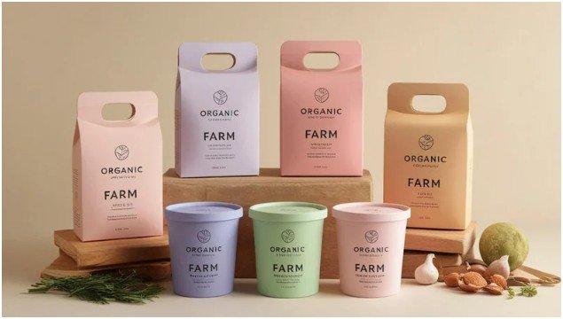
Wellness Brands
Wellness companies increasingly use soft greens, terracotta, muted browns, and warm neutrals.
These colors create emotional calm and support sustainability messaging. I have also noticed consumers trust softer palettes more than overly saturated “eco” branding because it feels less artificial.
Luxury and Fashion
Luxury branding often avoids loud color systems entirely.
Minimal black-and-white palettes dominate because simplicity feels expensive. Gold accents are common because they add exclusivity without overwhelming the design.
Branding Mistakes That Hurt Customer Trust

One of the biggest mistakes I see is businesses choosing colors based on personal taste instead of customer expectations.
I once reviewed a legal consulting brand using bright orange and lime green because the owner wanted something “fun.” The palette immediately weakened customer trust because it conflicted with the seriousness of the service.
Another common mistake is copying competitors too closely. Brands disappear visually when they look identical to everyone else in the market.
Overusing accent colors also creates problems. Too many bright highlights make websites feel chaotic instead of guiding attention naturally.
Strong branding usually comes from restraint rather than excess.
How to Choose Colors That Strengthen Your Brand
Match Colors With Customer Expectations
Customers subconsciously expect industries to look a certain way. That does not mean you should copy competitors, but your palette should still feel believable for your audience.
A cybersecurity company can look modern without appearing childish. A wellness company can feel premium without looking cold.
Balance Your Palette Correctly
Most effective brand systems use a structured ratio.
The classic 60-30-10 rule still works well across websites, packaging, and social media. The primary color dominates most of the design, the secondary color supports it, and the accent color highlights key actions.
This creates visual harmony without overwhelming users.
Test Colors Before Launching
Colors rarely look identical across every platform.
A shade that appears elegant on a laptop may print poorly on packaging or look different on mobile screens. I always recommend testing colors physically before approving a final brand system.
Many businesses skip this step and regret it later.
Improve Accessibility
Accessibility affects readability, usability, and SEO performance.
Poor contrast between text and backgrounds frustrates users quickly. Tools like Adobe Color and Coolors help brands test contrast ratios and create balanced palettes.
A Real Branding Example That Changed Customer Perception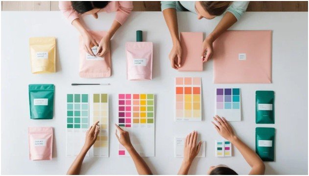
One of the most interesting redesigns I reviewed involved a subscription coffee company.
The original branding used bright orange, aggressive typography, and loud packaging. Customers regularly described the brand as cheap and overly commercial.
The company later switched to forest green, cream backgrounds, and matte black packaging. Customer feedback changed almost immediately. Buyers started describing the same coffee as smooth, premium, and artisanal.
Nothing about the recipe changed.
That experience reinforced something I strongly believe: customers often experience your branding before they experience your product.
Why Consistency Beats Trendy Design
Trend-based palettes fade quickly. Consistency creates recognition.
The strongest brands repeat the same colors across websites, ads, packaging, emails, and social media. That repetition trains customers to recognize the brand instantly.
This is one reason how color psychology impacts branding and continues to influence marketing performance so heavily. Familiarity creates trust, and trust influences buying behavior.
Brands that constantly change colors rarely build long-term recognition.
FAQs
1. How does color psychology affect consumer behavior?
Color influences emotions, trust, urgency, and purchasing decisions. Customers often react emotionally before evaluating products logically.
2. What is the best color for branding?
There is no universal best color. The right choice depends on your audience, industry, and brand personality.
3. Why do luxury brands use black?
Black creates feelings of sophistication, exclusivity, and elegance. It also supports clean minimalist branding.
4. How color psychology impacts branding in digital marketing?
In digital marketing, color affects engagement, readability, click-through rates, and brand recognition across websites and advertisements.
5. Should small businesses follow color trends?
Small businesses should focus more on consistency and customer expectations than temporary design trends.
Your Colors Speak Before Your Brand Does
Customers form opinions about your business before reading a single sentence.
That is the real power behind color psychology.
A strong palette quietly builds trust. A poor palette creates doubt instantly. The difference often determines whether someone keeps browsing or leaves your site within seconds.
Before choosing new brand colors, stop asking which shades simply look attractive.
Start asking what emotions those colors teach customers to feel.